Your GitHub profile is probably the first place people look when they want to see what you're about as a developer. For the longest time, mine was just... there. A list of repositories with no context, no personality, nothing that said "this is who I am and what I care about."
That changed when I decided to build a proper profile README. Not one of those generic, template-heavy ones you see everywhere, but something that reflects how I think about software and what matters to me as a developer.
Here's what went into it and why I made the choices I did.
Why Bother with a Profile README?
GitHub introduced profile READMEs back in 2020, and they've become the standard way developers present themselves. Think of it as your homepage on GitHub, the thing people see before diving into your code.
For me, the profile README serves three purposes:
- Context for recruiters and collaborators: Instead of just seeing a wall of repos, visitors get a sense of what I'm working on and what I'm good at.
- A quick portfolio: I can highlight my best work without forcing people to scroll through 90+ repositories.
- Signal versus noise: Not all projects are created equal. The README helps me show what matters.
The key here is that it's not marketing fluff. It's documentation. Good documentation tells the truth and makes things clearer, which is exactly what this should do.
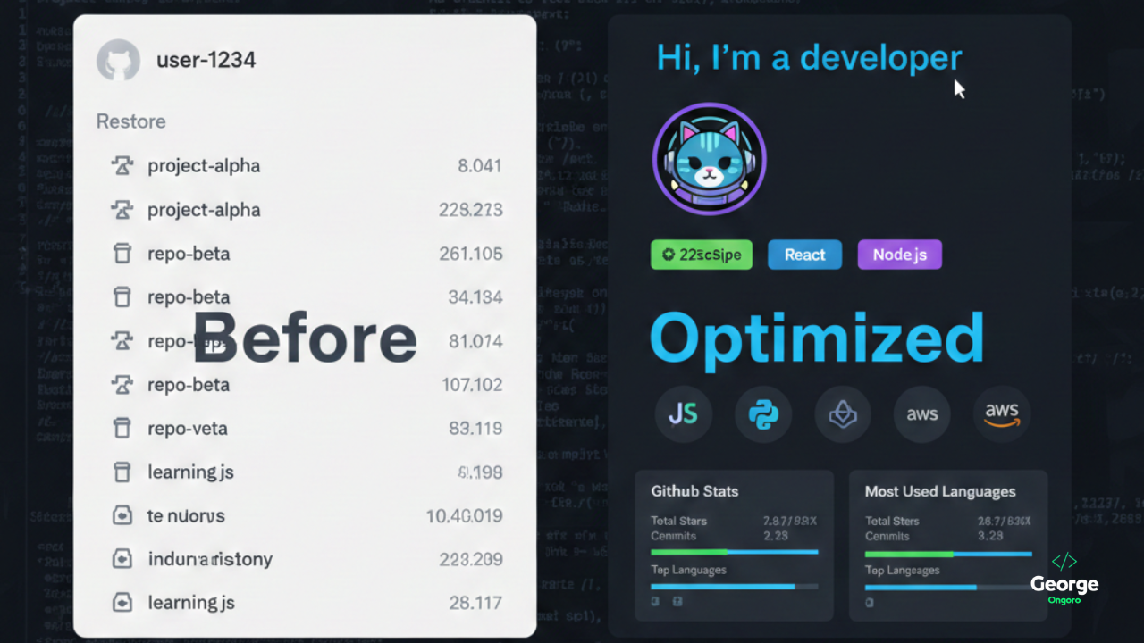
The Header: First Impressions Matter
I started with an animated typing effect using readme-typing-svg. It cycles through a few lines that sum up what I do:
<p align="center">
<img src="https://readme-typing-svg.demolab.com?font=JetBrains+Mono&size=28&pause=1000&color=38BDF8¢er=true&vCenter=true&width=600&lines=Hi+%F0%9F%91%8B+I'm+George+Ongoro;Full-Stack+Software+Developer;Builder+of+Useful+Things;Always+Learning%2C+Always+Shipping" alt="Typing SVG" />
</p>
The animation grabs attention, but more importantly, it tells you immediately what I do without being too formal. I chose JetBrains Mono because, well, it's a developer profile. The font should look like code.
Below that, I added my profile picture and some quick-access badges linking to my portfolio, blog, LinkedIn, and email. These use shields.io for consistent styling:
<a href="https://ongoro.top">
  <img src="https://img.shields.io/badge/Portfolio-0ea5e9?style=for-the-badge&logo=google-chrome&logoColor=white"/>
</a>
The badges are clean, recognizable, and clickable. That's the entire point: reduce friction between someone landing on my profile and finding the next step.
About Me: No Fluff, Just Facts
I kept the "About Me" section short and direct. No flowery language, no buzzwords like "passionate" or "results-driven." Just what I do, what I'm good at, and where I'm based.
The format is simple:
- What I build (systems that work in production, not demos)
- What I care about (simplicity, clarity, maintainability)
- Quick stats (90+ repos, located in Kenya, open to collaboration)
I included a quote at the bottom: "Build things that matter. Optimize later." It's a philosophy I try to follow. Ship working code first, then make it fast. Too many people get stuck in the optimization trap before they even have something running.
Tech Stack: Show, Don't Tell
Rather than listing technologies in plain text, I used skill-icons.dev to display them visually:
<img src="https://skillicons.dev/icons?i=js,ts,php,nodejs,react,nextjs,css,docker,git,github,azure,java,csharp&perline=7" />
This generates a grid of icons for JavaScript, TypeScript, PHP, Node.js, React, Next.js, CSS, Docker, Git, GitHub, Azure, Java, and C#. It's clean, scannable, and immediately tells you what I work with most.
Below the icons, I added a "What I build most" section:
- Full-stack web apps (dashboards, CMSs, SaaS tools)
- Auth systems and identity platforms
- Admin panels and analytics tools
- Desktop utilities (C#)
- APIs, integrations, and internal tooling
This clarifies the type of work I focus on. If you're looking for someone who builds mobile games or does machine learning research, you know immediately that's not me.
Featured Projects: Quality Over Quantity
I have 90+ repositories. Most of them are experiments, learning projects, or internal tools that aren't particularly interesting to outsiders. The "Featured Projects" section solves this by spotlighting the work that matters.
I formatted it as a table with two columns: project name (linked) and a one-line description:
| Project | What it does |
|------|------|
| **[NeonTek OAuth System](https://github.com/004Ongoro/OAuth-system)** | Centralized authentication system for NeonTek apps |
| **[Realty Management System](https://github.com/004Ongoro/realty-management-system)** | Complete real-estate management platform |
Tables work well here because they're structured and scannable. Each project name links directly to the repo, and the description tells you what it is without making you click through.
I also added a collapsible "70+ more projects" section using HTML details tags. This keeps the README clean while still acknowledging the rest of my work.
GitHub Stats: Numbers That Tell a Story
GitHub stats are everywhere in profile READMEs. Some people love them, some find them gimmicky. I included them because they provide useful context at a glance.
I used three stat cards:
- github-readme-stats for overall GitHub activity (stars, commits, PRs, issues)
- github-readme-streak-stats for contribution streaks
- github-profile-summary-cards for a detailed activity breakdown
<img src="https://github-readme-stats.vercel.app/api?username=004Ongoro&show_icons=true&theme=tokyonight&hide_border=true" height="170"/>
All three use the "tokyonight" theme for visual consistency. The stats aren't the main point of the profile, but they do show activity and engagement. If you're hiring or collaborating, it's useful to know someone is actively coding.
Developer Card: What I'm Reading and Learning
I added my daily.dev developer card, which shows the tech articles I've been reading. It's a small touch, but it signals continuous learning. Software moves fast, and staying current matters.
<a href="https://app.daily.dev/georgeongoro">
  <img src="https://api.daily.dev/devcards/v2/JCfNZtLPNzTFifdLCBjRk.png?type=default" width="350"/>
</a>
The card updates automatically based on my reading activity, which means the profile stays somewhat dynamic without requiring manual updates.
What I Skipped and Why
There are tons of widgets and features you can add to a GitHub profile README. Here's what I deliberately left out:
Spotify Now Playing: Cool, but not relevant to my work. If I were a music developer or working on audio tech, maybe. Otherwise, it's just noise.
Animated GIFs: Tempting, but they often slow down load times and can feel unprofessional depending on context.
Long Lists of Certifications or Courses: If certifications matter for your field, include them. For me, the work speaks louder than credentials.
The goal was clarity, not maximalism. Every element should serve a purpose.
Building Blocks: Tools That Made This Possible
If you're building your own profile README, here are the tools I relied on:
- readme-typing-svg: Animated typing text generator
- shields.io: Customizable badges for links and stats
- skill-icons.dev: Tech stack icon generator
- github-readme-stats: GitHub activity stats
- github-readme-streak-stats: Contribution streaks
- visitor-badge: Profile view counter (if you want one)
All of these tools are free, open-source, and easy to customize. Most of them work through simple URL parameters, which means you can tweak colors, fonts, and layouts without writing code.
The Philosophy Behind the Design
Here's the thing about GitHub profile READMEs: they're easy to overdo. You can add every widget, every badge, every stat imaginable, and end up with something that looks like a NASCAR sponsorship wall.
I approached this with a few principles:
Less is more: Every section should earn its place. If it doesn't add value, cut it.
Scannable over comprehensive: People skim. Use headers, tables, and icons to make information easy to digest.
Honest over impressive: The profile should reflect who you actually are, not some idealized version. If you're learning, say so. If you have 90 repos but only a few matter, be upfront about that.
Functional over flashy: Animations are fine, but functionality comes first. Links should work, descriptions should be clear, and navigation should be obvious.
The README isn't a resume. It's a landing page. It should guide people to what they're looking for without overwhelming them.
Maintaining It: Updates Without Overthinking
One risk with these profile READMEs is that they become stale. You build something nice, then never touch it again because updating feels like a chore.
I keep maintenance simple:
- Auto-updating elements: Stats cards and the developer card refresh automatically. No manual work required.
- Pinned projects, not hardcoded: I update the featured projects table when something significant changes, but I don't stress about keeping it perfectly current.
- Version control matters: The README lives in a repo, which means I can track changes, revert mistakes, and iterate over time.
If you're building one of these, don't make it so complex that updating it becomes a project in itself. Simplicity scales better.
What I Learned Building This
Building a profile README taught me a few things that apply beyond GitHub:
Presentation matters, even for technical work: Code quality is what counts, but if no one understands your projects, they won't engage with them. Good documentation and clear presentation make your work accessible.
Constraints force creativity: GitHub READMEs are just Markdown with some embedded images. You can't use JavaScript, you can't host dynamic content directly. Those constraints push you to think carefully about structure and layout.
First impressions are quick: People spend seconds, not minutes, on a GitHub profile. Whatever you're trying to communicate, it needs to be clear immediately.
If you're reading this and thinking about building your own README, my advice is simple: start minimal. Add a header, a short bio, and links to your best work. You can always expand later.
The GitHub profile README isn't a revolutionary feature, but it's a useful one. It gives you control over your first impression and helps visitors understand your work without digging through repositories.
Mine reflects how I think about software: clear, practical, focused on things that work. It's not perfect, and it'll probably evolve as I do, but for now, it does what it's supposed to: tell people who I am and what I build.
If you're looking to improve your own profile, think about what you want people to know when they land on your GitHub page. Then build the simplest possible thing that communicates that. Everything else is just decoration.
If you're working on something similar or have thoughts on what makes a good developer profile, I'd love to hear about it. Drop a comment below or reach out.
Related Reading:
- Authentication Is a UX Problem First - How I think about building auth systems
- Designing Systems for Low Traffic (Yes, That Matters) - Philosophy behind the projects I build
References: