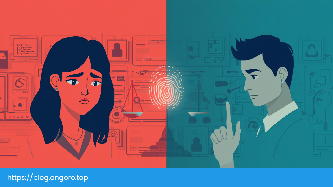
You know what's funny? We spend countless hours debating which authentication method is most secure, which encryption algorithm to use, and how many layers of protection we need. But here's the thing: if your users can't get past your login screen without wanting to throw their laptop out the window, all that security doesn't matter. They'll either give up, use workarounds that compromise your carefully crafted security, or worse, never come back.
Authentication isn't just a security problem. It's a UX problem first, and a security problem second. Let me explain why.
The Login Friction Problem
Think about the last time you tried to log into a website you hadn't visited in months. You probably went through something like this: wrong password, password reset, check email, click link, create new password, forget to write it down, repeat the cycle next time.
Login friction is the enemy of user engagement. Every extra step, every confusing field, every unclear error message is a chance for users to abandon your app. When people talk about "friction," they're not being dramatic. There's real data showing that users will literally walk away from services they want to use because the login experience is too painful.
What Creates Login Friction?
Here's what makes logging in feel like pulling teeth:
Too many fields. Do you really need both username AND email? Do you need their phone number before they've even used your product? Every field you add is another barrier between your user and your actual application.
Unclear password requirements. Nothing says "we don't care about your experience" like making someone guess your password rules. Is it 8 characters or 12? Do you want special characters or not? Showing these requirements upfront instead of after the first failed attempt saves everyone time and frustration.
No social login options. Look, I get it. You want users to create accounts directly with you. But when someone just wants to try your app, making them go through a full registration flow vs clicking "Continue with Google" is a conversion killer.
Mobile nightmares. Typing complex passwords on a tiny keyboard is nobody's idea of fun. If your login form doesn't support autofill, biometric authentication, or at least a "show password" toggle, you're making life harder than it needs to be.
Making Login Smoother
The solution isn't to eliminate security. It's to make security invisible. Let users log in with their fingerprint or face on supported devices. Implement passkeys that remove passwords entirely from the equation. Support password managers properly with autocomplete attributes.
Think about it this way: the fastest login is the one that happens without the user noticing. Gmail doesn't make you log in every single time you check your email. Netflix remembers you. Your banking app uses biometrics. These aren't accidents. They're deliberate UX decisions that recognize security should enable users, not block them.
Session Expiry: The Silent Conversion Killer
Picture this: you're in the middle of filling out a long form. Maybe you're applying for something, writing a detailed message, or configuring settings. You pause to grab coffee. When you come back, boom: "Your session has expired. Please log in again."
And guess what? Your work is gone.
This is one of the most frustrating experiences in web applications, and it happens because security teams and UX teams don't talk to each other enough.
The Security vs Usability Balance
Security guidelines will tell you to set short timeout periods. OWASP suggests 2-5 minutes for high-risk applications and 15-30 minutes for low-risk ones. NIST recommends re-authentication every 12 hours and session termination after 30 minutes of inactivity.
But here's the problem: these recommendations don't account for how people use applications. Someone reading a long article isn't "inactive." Someone comparing your product with a competitor in another tab isn't abandoning your site. They're using it, just not in the way your timeout tracking expects.
Better Session Management
Instead of rigid timeouts that treat all inactivity the same:
Use sliding expiration. If someone's actively using your app, extend their session. Don't log them out in the middle of a task just because they're approaching some arbitrary time limit.
Match timeouts to context. A banking app handling transactions? Sure, be aggressive with timeouts. A media site where users read articles? Give them breathing room. Not everything needs Fort Knox levels of security.
Warn before logging out. If a session is about to expire, show a clear dialog that explains what's happening and gives users a chance to stay logged in. Make sure this warning is accessible to screen readers and people using assistive technologies.
Save work in progress. If you absolutely must log someone out, at least try to preserve what they were doing. Draft emails, form data, configuration changes - these things can often be saved temporarily and restored after re-authentication.
The key insight here: session management should feel invisible when things are working right, and graceful when intervention is needed.
Password Resets: Where Good UX Goes to Die
Password resets are where many otherwise decent authentication systems completely fall apart. And I'm not exaggerating. Research suggests that around 10% of active users get stuck in password reset flows monthly, and three-quarters of them give up. That's a massive leak in your user funnel.
Why Password Resets Fail
Unclear entry points. That "Forgot password?" link needs to be obvious, not hidden in tiny gray text at the bottom of the form. When users can't find it, they'll try random passwords until your system locks them out.
Mystery email addresses. You ask users to enter their email to reset their password, but they don't remember which email they used. Yahoo? Gmail? That old Hotmail account from 2008? Help them out. If they're logged into your app elsewhere, show them which email is associated with their account (partially masked for security, obviously).
Email delays. Nothing breeds anxiety like waiting for a reset email that may or may not arrive. If the email doesn't show up in a few minutes, users assume something broke. Give them clear expectations and a way to resend.
Cryptic requirements. The password reset screen is not the time to surprise users with new password rules. Show the requirements clearly, with visual feedback as they type. Green checkmarks for met requirements feel encouraging. Red X's for violations feel like failure. Pick the right psychological framing.
Loss of context. When users click that reset link in their email, take them directly to password creation, not back to your login page where they have to figure out what to do next.
Making Resets Work
Here's what good password reset UX looks like:
Pre-fill the email address from the login attempt when possible. If they just tried to log in as "john@example.com" and failed, carry that over to the reset form. Don't make them type it twice.
Show password strength feedback that's helpful, not judgmental. "Your password is weak" is discouraging. "Add 2 more characters for a stronger password" is actionable guidance.
Use real-time validation. Show people immediately whether each requirement is met. Waiting until they submit the form to tell them they missed something is just mean.
Consider letting users create their own passwords instead of generating random ones. Nobody remembers "Kj8#mP2$qL9w" but they might remember "coffee-morning-bicycle-2024" (yes, passphrases are valid passwords).
And please, for the love of good UX, don't make them enter the new password twice. If you have a "show password" toggle, confirmation fields are unnecessary and just add friction.
Error Messages: Your Last Chance to Keep Users
Error messages are where authentication UX either saves the day or completely fails. A bad error message is worse than no error message because it frustrates users without helping them.
What Makes Error Messages Bad
Generic messages like "Authentication failed" or "Invalid credentials" tell users nothing useful. Which credential was invalid? What should they try next? This is the equivalent of a teacher marking your test wrong without telling you which answers were incorrect.
Technical jargon doesn't help either. "Error 401: Unauthorized" means something to developers. To regular users, it's gibberish. Speak in plain language.
And whatever you do, don't blame the user. "You entered an incorrect password" sounds accusatory. "Password doesn't match" is neutral and informative.
Error Messages That Actually Help
Good error messages follow a simple pattern: they're clear, specific, and constructive.
Be clear. "Incorrect email or password" is better than "Login failed." Even better: "We couldn't find an account with that email" (though be careful with this level of specificity if account enumeration is a security concern for you).
Be specific when safe. If the email is right but the password is wrong, say so. If the account is locked, explain why and how long until it unlocks. If there were too many failed attempts, mention that and offer a way forward.
Be constructive. Every error message should answer: "What should I do now?" Pair each error with a clear action. Wrong password? "Reset your password here." Account locked? "Try again in 5 minutes or contact support." Email not found? "Sign up instead."
One pattern I've seen work well: progressive disclosure of help. First attempt fails? Show a basic error. Second attempt? Add a hint about password requirements or common mistakes. Third attempt? Offer direct help like "Having trouble? Reset your password" or "Contact support."
And remember: make errors accessible. Screen readers should announce errors clearly. Error messages should have sufficient color contrast. Focus should move to the error or the field that needs correction. This isn't just nice to have; it's essential for many users.
The Security vs Usability Tightrope
Here's the uncomfortable truth: perfect security and perfect usability are often in conflict. The most secure password is the one nobody can remember or type. The most usable login is no login at all.
But that's a false dichotomy. The real question isn't "security or usability?" It's "how do we achieve both?"
When Security Undermines Itself
Ironically, excessive security measures often make systems less secure. Here's how:
Complex password requirements lead to password reuse. When you force users to create passwords with uppercase, lowercase, numbers, special characters, and the blood of a unicorn, they'll create "Password123!" and use it everywhere. You've created the illusion of security while encouraging the exact behavior you're trying to prevent.
Frequent password changes lead to predictable patterns. Remember when everyone had to change their password every 30 days? Users just incremented a number. "Password1" became "Password2" became "Password3." Great job, security team.
Too many security questions get answered dishonestly. When you ask for mother's maiden name, first pet, and favorite teacher, users either give real answers (which can be discovered through social engineering) or make up answers they can't remember later. Either way, security theater.
Finding the Balance
The best authentication systems recognize that humans are part of the security model, not an obstacle to it. Some practical approaches:
Use adaptive security. Don't treat every login the same. Logging in from a recognized device on your home network? Minimal friction. Logging in from a new device in a different country? Add extra verification. This is what good multi-factor authentication looks like.
Make security invisible when possible. Biometric authentication, passkeys, and device-based trust are examples of security measures that add protection without adding friction. Users tap their fingerprint sensor; your app stays secure. Win-win.
Educate, don't enforce. Instead of forbidding short passwords, show a password strength meter and explain why longer is better. Let users make informed decisions. Most people want to be secure; they just don't want to be annoyed.
Provide escape hatches. Security shouldn't trap users. If someone loses access to their phone with their authenticator app, there should be a recovery path that's secure but not impossible. Account recovery is just as much a UX challenge as initial authentication.
This balancing act is why authentication is fundamentally a UX problem. Security features that users can't or won't use aren't making anyone more secure. They're just making your product harder to use.
Modern Authentication: Beyond Passwords
Let's talk about the future, which is increasingly looking like a world without passwords. And honestly? About time.
The Password Problem
Passwords are a terrible authentication mechanism when you think about it. They're:
- Hard to remember (especially secure ones)
- Easy to steal (phishing, keyloggers, data breaches)
- Often reused (defeating the whole point)
- Frustrating to manage (password managers help, but adoption is still low)
The only reason we still use passwords is inertia. They're familiar, widely supported, and don't require special hardware. But "we've always done it this way" is not a great argument for keeping a broken system.
Enter Passwordless Authentication
Passwordless authentication isn't a single technology. It's a category of approaches that prove identity without requiring users to remember a secret:
Email magic links send a login link to the user's email. Click the link, you're in. No password needed. This works because your email account is already password-protected (or should be), so it's basically delegating authentication to a system the user already manages.
SMS one-time codes work similarly but via text message. They're convenient and familiar, though SMS has some security weaknesses like SIM swapping attacks.
Biometric authentication uses your fingerprint, face, or other physical characteristics. It's fast, convenient, and increasingly secure. Face ID and Touch ID have made this mainstream.
Passkeys are the most promising evolution. They use cryptographic key pairs: a private key stored securely on your device, and a public key held by the service. When you log in, your device proves it has the private key without ever transmitting it. It's phishing-resistant, convenient, and backed by industry standards.
The Biometric Question
Biometrics deserve special attention because they're everywhere now, but they're often misunderstood.
Biometrics aren't passwords. Your fingerprint or face is more like a username - an identifier. The real security comes from the cryptographic keys stored in your device's secure hardware, which are unlocked by the biometric check.
Also, your biometric data never leaves your device. When you use Face ID to log into an app, the app doesn't receive your facial data. It receives confirmation that the biometric check passed and the secure key was successfully unlocked. This is an important distinction for privacy.
Implementation Realities
Moving to passwordless authentication isn't flip-a-switch simple. You need to:
- Support multiple authentication methods (not everyone has biometric sensors)
- Handle edge cases (lost devices, hardware failures, user preference)
- Provide clear migration paths (users with existing passwords need a way forward)
- Maintain security (passwordless doesn't mean security-less)
But the payoff is worth it. Users who can log in with a fingerprint tap are more likely to log in often, less likely to get locked out, and generally happier with your product.
If you're already working on authentication improvements, you might also want to check out rate limiting strategies to protect your login endpoints from abuse, and understand when NOT to use JWT authentication for session management.
Progressive Enhancement in Authentication
Here's something that doesn't get talked about enough: your authentication system should work even when things go wrong.
What if JavaScript fails to load? What if the user has a really old browser? What if their network is spotty? Your login should still function, even if it's not as polished.
This is called progressive enhancement, and it's crucial for authentication:
Start with working HTML forms. A basic form that submits to your server will work in any browser, with or without JavaScript. This is your foundation.
Add client-side validation with JavaScript. Check if fields are filled in, validate email formats, show password strength. But don't rely on this - always validate on the server too.
Layer on fancy features for modern browsers. Autofill support, biometric authentication, real-time feedback - these are enhancements for capable browsers, not requirements.
The beauty of this approach: everyone gets a working login. Some users get a great login. But nobody gets a broken login.
Accessibility: Authentication for Everyone
Authentication UX isn't just about making login fast and pretty. It's about making it possible for everyone.
Consider these users:
- Screen reader users who need clear labels and error announcements
- Keyboard-only users who need focusable elements and clear tab order
- Users with motor disabilities who need large click targets and generous timeouts
- Users with cognitive disabilities who need clear instructions and consistent patterns
- Users in low-bandwidth situations who need lightweight pages that load quickly
Making authentication accessible isn't extra work on top of good UX. It is good UX. Clear labels help everyone. Proper focus management helps everyone. Adequate contrast helps everyone.
Some practical tips:
Use semantic HTML. <label>, <input>, <button> - these elements have built-in accessibility features. Don't replace them with divs and spans just because you can.
Provide clear labels for every input. "Email" and "Password" shouldn't just be placeholder text that disappears when users start typing. They should be proper labels that remain visible.
Announce errors to screen readers. Use ARIA live regions to announce errors as they occur. Don't just change color or show an icon - some users can't see those.
Support keyboard navigation. Every interactive element should be reachable via keyboard. Tab order should be logical. Enter key should submit forms.
Give users time. If you must have timeouts, make them generous and provide warnings. People read at different speeds, type at different speeds, think at different speeds.
Test with real people. Automated accessibility checkers catch maybe 30% of issues. Real testing with people using assistive technologies catches the rest.
Bringing It All Together
Authentication is where security meets the user. Get it right, and it's invisible - users flow through to your actual product without friction. Get it wrong, and it becomes the thing users remember most about your app, and not in a good way.
Good authentication UX means:
- Minimizing friction at every step
- Making security feel invisible, not burdensome
- Providing clear feedback and helpful error messages
- Respecting users' time and context
- Supporting diverse users and use cases
- Choosing appropriate security measures for your use case
Remember: the most secure system is worthless if users can't use it. And the most beautiful login screen is pointless if it doesn't actually keep accounts safe.
Start with your users. Understand their context, their devices, their capabilities, and their pain points. Build authentication that works for them, then layer security on top. Not the other way around.
The future of authentication is passwordless, biometric, and seamless. But the present is passwords, sessions, and password resets. Meet users where they are, but build toward where they're going.
And above all: test your authentication with real users. Watch them struggle with your password requirements. See them get confused by your error messages. Feel their frustration with your session timeouts. That's the only way to build something that actually works.
Because at the end of the day, authentication is a UX problem first. Security without usability is just security theater. And nobody has time for that.